Nothing gets us as excited as decoding the colors of the season. At fashion month SS20 designers across the board turned away from the back-to-basics neutral palette they’d adopted just a year ago, embracing instead juicy, zesty, and sweet shades that were good enough to eat. We may be stuck at home for the foreseeable future, but who doesn’t want a sartorial serotonin boost to keep spirits up? From tangy sherbet lemon and satsuma to softly-does-it mint green and lavender-field lilac, there’s a standout shade for every taste, so we shot found objects from around the house to reflect our current colorful mood.
Cherry Tomato
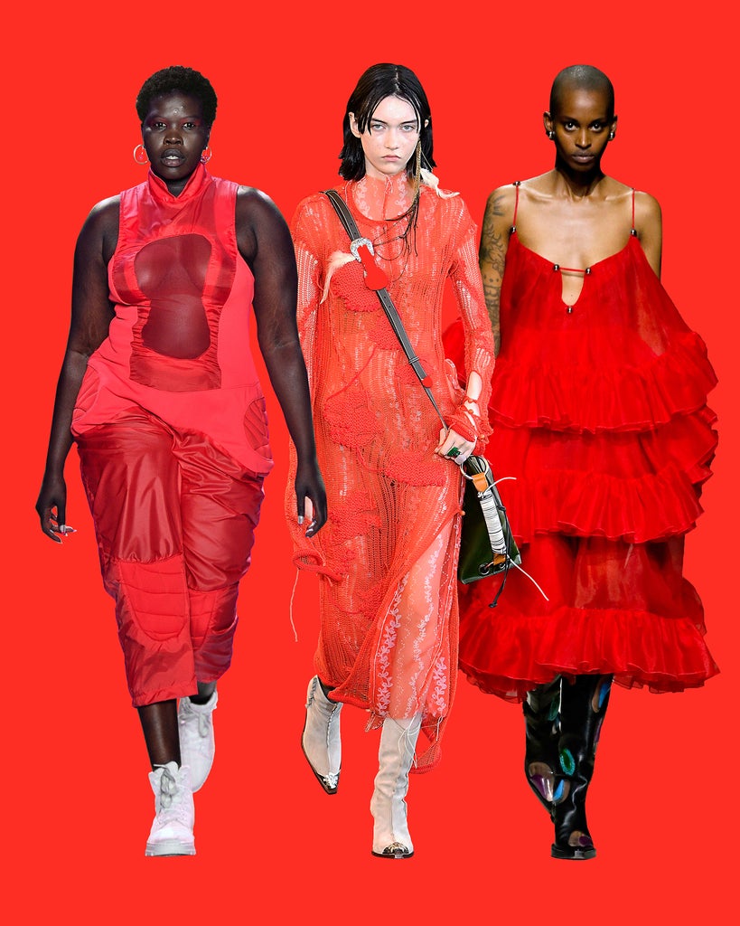
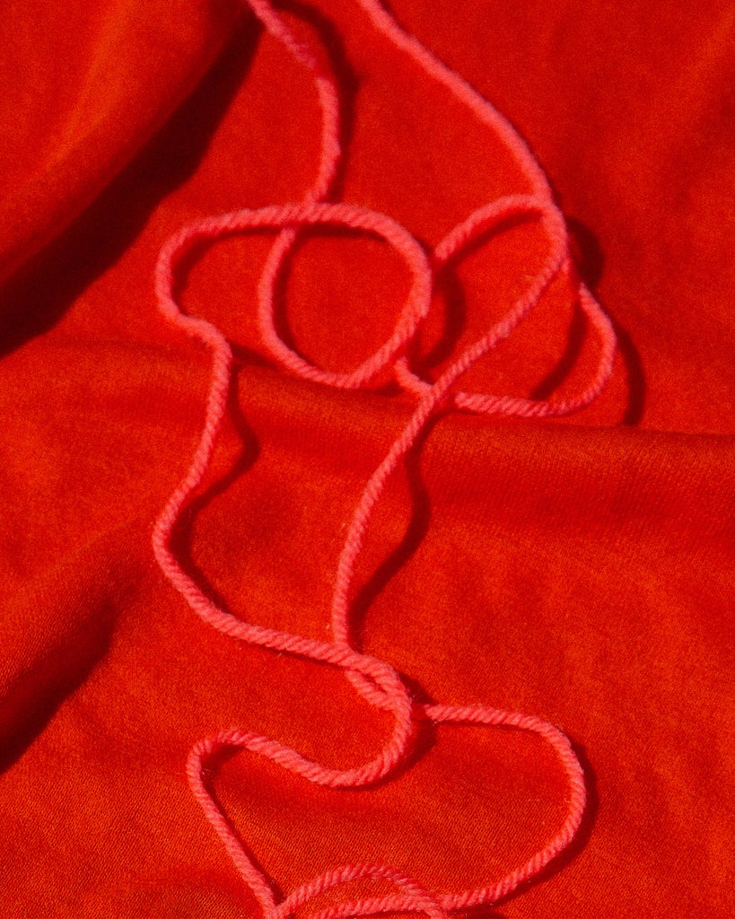
Pantone’s 18-1662 shade is called Flame Scarlet but for us the hue is no doubt that of a rich and juicy cherry tomato. “Burning bright, Flame Scarlet exudes confidence and determination,” reads the shade’s description and we couldn’t agree more: this one ain’t for wallflowers. Christopher Kane’s frothy, frilled spaghetti strap dress was our favorite at London Fashion Week, while Acne Studios and Chromat made a great case for pairing the color with ice-white shoes. Vibrant tomato hues complement all skin tones and look great when doubled up with matching lipstick, too.
Sherbet Lemon
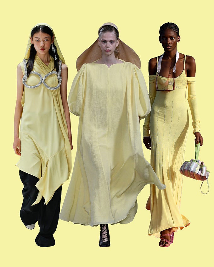
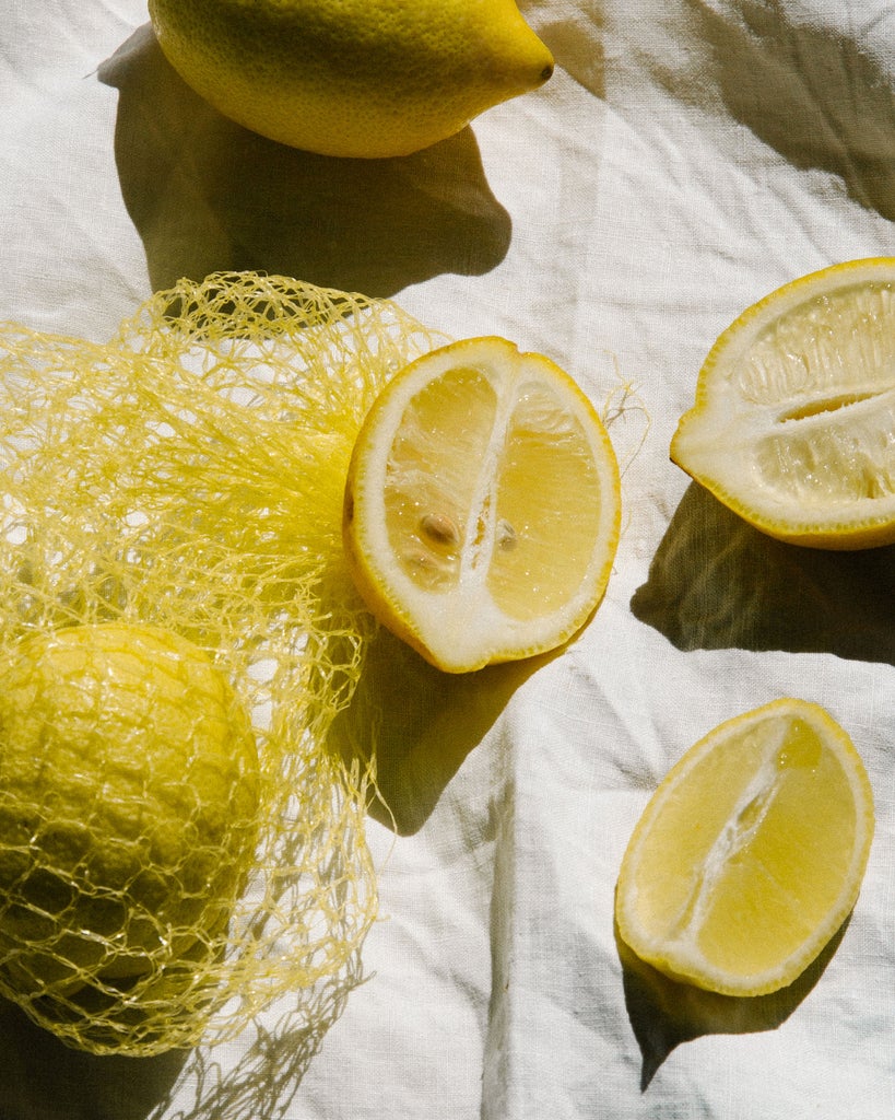
We’ve waxed lyrical about the joy of yellow before and this season the sunny hue is permeating collections and bringing a much-needed dose of optimism to our wardrobes. Pantone’s 13-0822 is dubbed Sunlight — “inviting happiness, pleasant cheer, and a smiling presence” — but we much prefer the connotations of tongue-tingling sherbet lemon, which we saw at Jacquemus’ dreamlike lavender field show in Provence (lilac and lemon make great bedfellows, FYI) and in London at JW Anderson and Emilia Wickstead.
Frothy Cappuccino
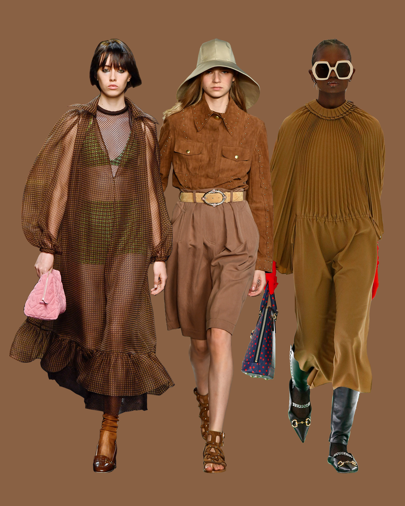
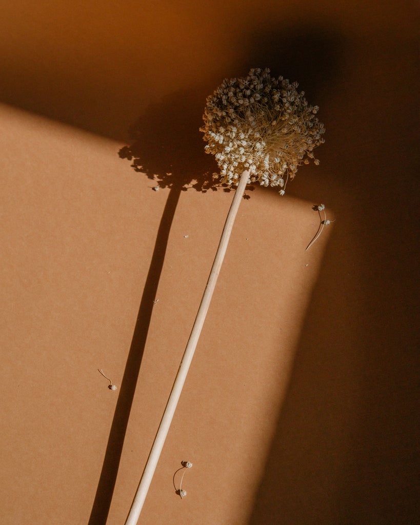
Soft-touch neutrals from camel to greige were so pervasive a few seasons ago that we thought we were seeing fashion month street style through sepia-tone eyes. Thankfully the trend moved on and richer shades of brown came to the fore. Enter: cappuccino, which allows monochrome loyalists to feel as though they’re mixing things up and is the perfect neutral for maximalists to pair with everything from fuchsia to fiery red. Gucci and Fendi presented loose-fitting brown gowns in soft fabrics, while Alberta Ferretti gave us an homage to Laura Dern’s turn in Jurassic Park.
Mint Green
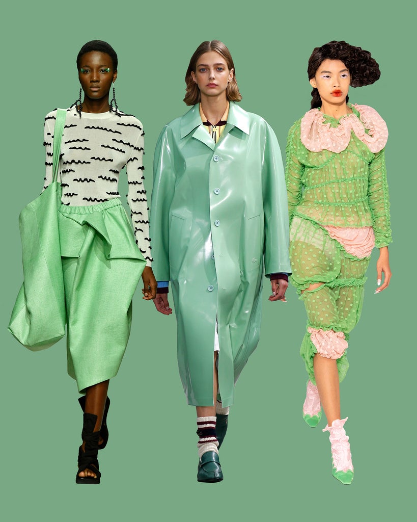
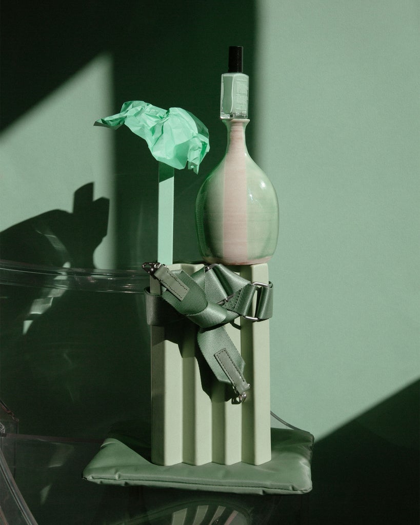
Shades of green, from crunchy apple to biohazard neon to classic Kermit, have reigned supreme for some time now. Last season more serious and subdued tones like olive and sage dominated, but for spring and summer 2020, it’s all about staying minty fresh. From Fashion East to Lacoste via Christian Wijnants in New York, mint greens clashed with baby pinks and zesty oranges for the ultimate Instagram-friendly palette pairing.
Zingy Satsuma
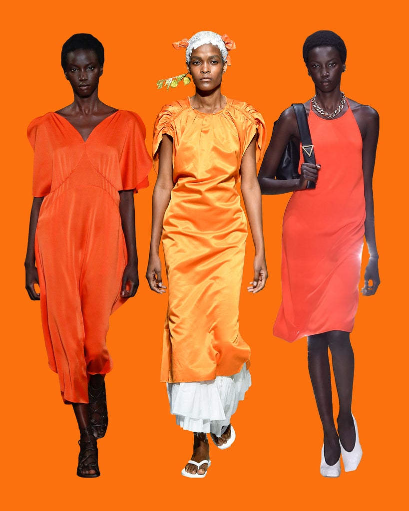
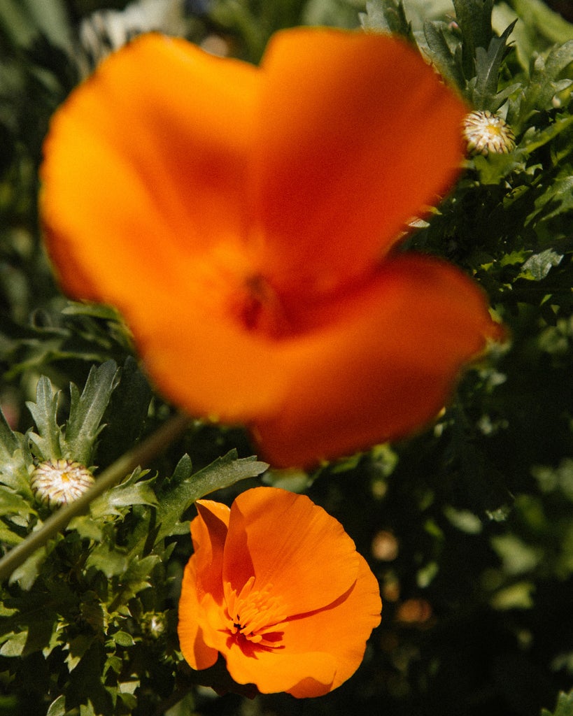
Much like green, orange took up the mantle of fashion’s favorite color after millennial pink and Gen Z yellow got old. Pantone calls this one Orange Peel – “a tasteful tang” – and it couldn’t feel more fresh. A highly saturated warm orange, we saw designers as varied as Stella McCartney, Marni, and Bottega Veneta embrace the satsuma hue this season. Another shade that gets stronger when paired with white accessories, it’s the only color we’ll be donning on our long-awaited holidays.
Parma Violet
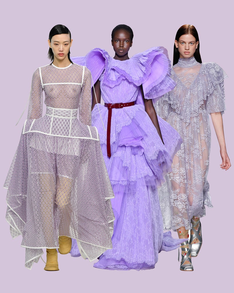
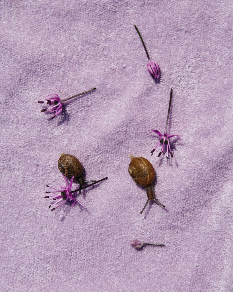
Finally, the most fanciful colour of the bunch: Parma Violet. The saccharine shade of purple lends itself well to the trappings of hyperfemininity, from frills to ruffles, and only gets more vivid when paired with reds, yellows, and greens. Preen by Thornton Bregazzi topped off a tulle gown with silver ballet pumps, Givenchy belted its voluminous creation, and Loewe gave lilac a thoroughly modern twist with white piped edging. Sweet!
Like what you see? How about some more R29 goodness, right here?
These 6 Spring Color Trends Will Brighten Your Day

No comments:
Post a Comment